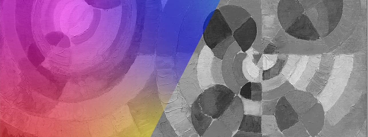
Rainbow #5 - A Digression: The Faces of Colour Theory
The Beginnings
In colour theory, colour phenomena, the interplay of colours and their effect on the observer are explored. It all began with the philosopher and scientist Aristotle. He assigned different colours to the course of the day: colours developed linearly from white at sunrise (light = morning, noon) to black at sunset (dark = evening, night). White becomes yellow becomes orange becomes red becomes violet becomes green becomes blue becomes black. When working out his colour theory, Aristotle also experimented with the way light falls through a blue and a yellow glass and observed the formation of a green colour stain when he held the blue and yellow glass pieces in front of each other against a white wall.
In the 15th century, the artist and scientist Leonardo da Vinci laid one of the first important theoretical foundations for the systematic arrangement of colours. He started from an arrangement of the primary colours blue, red, yellow and green and studied their colour-harmonic effects such as the simultaneous contrast and the complementary colours. He deepened his observations of light and shadow, which he incorporated into his paintings. In the light he recognised the quality and intensity of colour. Where there is light, the colour should be most intense and shown to its best advantage. In the shadow, the colour should take on the tone of the shadow and be equally dark compared to other colours. For him, white and black are not (real) colours. White was the «neutral receiver of every colour», it would reflect all colours. Black would not appear any blacker next to white than it would if it were next to black. The same is true in reverse for the white.
The rainbow also played an important role in the development of his colour theory. He realised that a rainbow is not produced by the sun alone, but is rather an interplay of rain, sun and the human eye, but can also be produced by the reflection of the sun's rays on a diamond surface. In the middle of the rainbow, da Vinci observed the mixing of yellow and blue to form green and noticed that the colour shines most vividly when placed next to its complementary colour partner, i.e., the colours that have the greatest contrast to each other.
The Colour Disc
The physicist Sir Isaac Newton began his research in the 18th century, based on da Vinci's theories. He discovered that white light is broken down into rainbow colours by refraction in a glass prism. He defined these variegated colours as the spectral colours and determined the seven colours red, orange, yellow, green, blue, indigo and violet as the primary colours for his colour disc (1704) (Fig. 1). He was the first to arrange the colours in their dependence on each other in a circle.
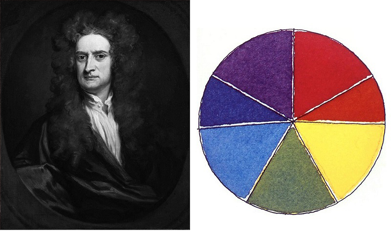
Fig. 1: Portrait of Sir Isaac Newton, Newton's Colour Disc (1704).
Goethe observed Newton's findings, but countered his theory that white light was composed of the sum of the spectral colours with his own view that colour was created by a dualistic interaction, a power struggle between light and dark. According to Goethe, there are two pure colours, yellow and blue. If these two colours were superimposed, a yellow and blue edge would emerge. Depending on the proportion of brightness (more yellow) and darkness (more blue), the colour red, the two mixtures green as well as purple and further colour gradations would be formed.
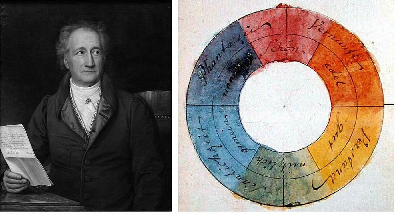
Fig. 2: Portrait of J. W. von Goethe (1828), Goethe's colour wheel (1809).
Goethe's colour wheel (Fig. 2) is composed of an inner and an outer circle. He divided the inner circle into six colour tones. Goethe identified the red colour with the quality «beautiful», the orange colour with «noble», the yellow colour with «good», the green colour with «useful», the blue colour with «mean», the dark blue-violet colour with «unnecessary». The outer circle consists of four parts. He defined the red-orange area with the value «reason», the yellow-green area with «understanding», the green-blue with «sensuality» and the dark blue-violet-red with «phantasy».
Goethe wrote down his theory of colours in 1810. In it, he also formulated his first thoughts on colour psychology; the effect and the «allegorical, symbolic, mystical use» (org. germ. «allegorischen, symbolischen, mystischen Gebrauch») of colour and presented a colour wheel to symbolise the human mental and spiritual life, which does not differ significantly visually from Newton's colour wheel. Goethe's colour theory is only of historical value for art today.
The Colour Sphere
Artists such as Philipp Otto Runge (1777 - 1810) took Goethe's colour theory and developed their own colour theory from it.
After studying at the Academy of Arts in Copenhagen, Runge went to Dresden, where he took a closer look at colour theories in 1810 and published a three-dimensional colour system, a colour sphere (Fig. 3), at the same time as Goethe.
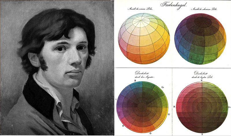
Fig. 3: Self-portrait Philipp Otto Runge (ca. 1802), Runge's Colour Sphere.
The colour sphere shows the graduated mixing ratio of 12 colour tones between light (white) and dark (black). The mixtures are based on the pure primary colours red, blue and yellow, which run along the equator in equal distances to each other. In them, Runge saw the «Trinity of God». Between the pure three colours lie the respective mixtures of orange, violet and green. The poles of the sphere represent the two non-colours white and black. Runge saw good in the light and evil in the darkness. At the centre of the colours is grey. It is the union of all colours and also results from mixing the non-colours white and black.
Although the sphere shows the gradations of the mixtures between the three primary colours as well as to white or black, Runge himself was not concerned with visualisation as such, but with the representation of the harmony and order of colours. On the basis of his colour sphere, Runge explored the relationships of the colours to each other, their effect, above all also the changed effect on people depending on the mixing ratio and numbered the scheme with colour names. He himself, like Goethe before him, criticised Newton's science, because on the one hand it neglected the effect of colours and on the other hand it was inaccessible to artists. Runge's colour sphere, on the other hand, was intended to serve as a practical aid for artists.
The Hemisphere
In the 1830s, the French chemist Eugène Chevreul took a closer look at colour contrasts in order to create a systematic breakdown of colour aesthetics for the dyeing of textiles. In 1839, his theory «De la loi du contraste simultané des couleurs » (engl. «The Law of the Simultaneous Contrast of Colours ») was published. With this theory, Chevreul laid another important foundation in colour theory and had a decisive influence on the later art movements of Impressionism, Neo-Impressionism and Orphic Cubism.
While Leonardo da Vinci had already established in his time that colours that lay next to each other influenced each other, and Goethe later examined colour contrasts in greater detail, Chevreul concentrated once again in greater depth on this subject as well as on colour organisation in order to develop a law of colour harmony.
As a result, he created a circle of 72 colours (Fig. 4 middle), which was built up from the three primary colours red, yellow and blue and their respective 23 mixed colours. The circle is divided into 12 compartments consisting of the three primary colours (red, yellow, blue), the three primary mixtures orange, green and violet and the six mixtures of these, i.e., red-orange, yellow-orange, yellow-green, blue-green, red-violet and blue-violet. In the circle, the primary colours are placed opposite their complementary partner. Chevreul's colour circle illustrates that the colour gives a complementary colour tone to the neighbouring colour. This causes the opposite complementary colours to brighten each other. The non-complementary colours, on the other hand, would influence the colour to acquire a tint cast of its complementary partner, i.e., if red, lying next to blue, visualises a green tint. The effect of our eye simultaneously perceiving its complementary colour in the vicinity of a colour is defined as simultaneous contrast.

Fig. 4: Portrait of Michel Eugène Chevreul, Chevreul's Colour Circle and Hemisphere.
In the form of a hemisphere (Fig. 4 on the right) Chevreul expanded his colour organisation and presented it spatially by assigning to each of the radial areas a respective ten-part gradation to light (white = higher intensity) and a ten-part gradation to dark (black = weaker intensity).
The Colour Star
Johannes Itten's colour wheel was based on Philipp Otto Runge's colour sphere and Adolf Hölzer's colour theory. Taking Hölzer's colour theory as a starting point, Itten first created a six-rayed colour star reminiscent of Goethe's colour wheel. He saw many parallels to music and, analogous to Josef Matthias Hauser's musical twelve-tone experiments of 1919, created the twelve-part colour circle (Fig. 5).
In doing so, he transferred the colour scales of Runge's three-dimensional sphere into two different 12-part schemes. One of them represents a star, the other a rectangle. Both show how the colours relate to each other and to white and black by depicting the seven-part gradations of the colours from light to dark and the complementary contrasts. Itten published his colour theory in 1921 in the almanac Utopia.
Itten, too, was concerned with the harmony and order of colours and also emphasised colour contrasts in his colour theory.

Fig. 5: Photo by Johannes Itten ©CC BY-SA 3.0, Colour sphere by Itten (1921) ©Public domain US.
The Basic Forms
Wassily Kandinsky took Itten's place at the Bauhaus in Weimar in 1922, where he taught the theory of form and colour. It was he who assigned to the primary colours blue, red and yellow their basic shapes of circle, square and triangle, which are very much characteristic of the Bauhaus today (Fig. 6).

Fig. 6: Photo by Wassily Kandinsky, basic forms and their colours.
Inspired by Goethe's studies in the psychology of colour, Kandinsky wrote «On the Spiritual in Art» in 1911. He not only recognised a connection between colours and forms, but also assigned different sensory impressions (= synaesthesia) to them. This was followed in 1926 by his theory «Point and Line to Surface».
For him, the following pairs of opposites exist: blue (cold, sky) - yellow (warm, earth), black (dark) - white (light), red - green and orange - violet.
The Colour Wheel
«Colour possesses me. I don't have to pursue it. It will possess me always, I know it. That is the meaning of this happy hour: Colour and I are one. I am a painter.» (Quote Paul Klee, 1914, original: «Die Farbe hat mich. Ich brauche nicht nach ihr zu haschen. Sie hat mich für immer, ich weiß das. Das ist der glücklichen Stunde Sinn: ich und die Farbe sind eins. Ich bin Maler.»)
A well-known quotation from a German painter who had nothing to do with colour at the beginning of his artistic career. It was not until his trip to North Africa in 1914, where he experienced particular colour intensities as well as light moods, that Paul Klee was inspired to use colour. The decision to use colour changed his work forever.
The artist maintained close contact with Itten and devoted himself to his experiments in colour theory. He met Itten in Munich in 1916 and 1919. From 1921/22 Klee studied the colour theories of Goethe, Runge, Delacroix and Kandinsky more intensively at the Bauhaus in Weimar. He himself based his colour organisation on the rainbow, which for him represented the scale of pure colours.
Like Goethe and Runge, Klee criticised the Newtonian spectrum and distanced himself from the assumption that colours were created from the refraction of white light. Instead, he assigned colours to the «border zone between atmosphere and outer space» (original. «Grenzbereich zwischen Atmosphäre und Weltall»). Likewise, he rejected the parallels to music pursued by other artists such as Itten and Kandinsky.
Klee's first colour models were created in the early 1920s. Similar to Runge's colour sphere, the grey is in the centre. The grey point functions as the centre of the colour order and sets the standard for the harmony of all colour relations. The poles are white and black. Along the equator exists the scale of the six complementary chromatic colours: Yellow, blue and red as primary colours and green, orange and violet in between (Fig. 7, middle). The colour wheel (Fig. 7 on the right) shows a two-dimensional arrangement of the same theory. The primary colours red, yellow and blue form the outermost pivots, with their complementary colours violet, orange and green between them. Here there is another addition that closes the colour wheel in a circle: the mixed colours of the primary and complementary colours, i.e., red violet, red orange, yellow orange, yellow green, blue green and blue violet. Here, too, the grey forms the centre.
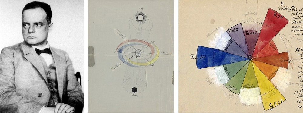
Fig. 7: Photo by Paul Klee (1927), colour wheels by Klee from his manuscript on design theory ©Zentrum Paul Klee
Later, however, Klee revised his initial colour-theoretical statements again and reformulated that the mixture of white and black, i.e., grey, did not represent the centre of colour harmony but was a «pollution». From then on, grey was no longer part of his colour circle.
Klee's notes on his pictorial theory of form and design, which were written between 1921 and 1931 at the Bauhaus in Weimar and Dessau and comprise around 3,900 pages, are kept in the archive and are accessible online at the «Zentrum Paul Klee» in Bern. So far, however, the transcription exists only in German (as is the original).
Application in Art
The search for colour harmony not only accompanied Klee theoretically, but also inspired him to paint. In the process, he created abstract non-objective pictures for «colour harmony» in the form of grid paintings (Fig. 8).
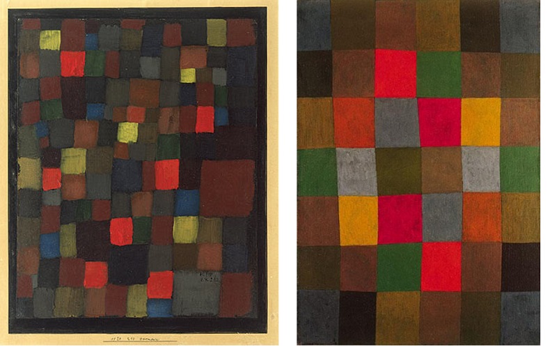
Fig. 8: Selection of works by Paul Klee: from left to right: Abstract Colour Harmony in Squares with Vermilion Accents (1924) ©Public domain US, New Harmony (1936).
Klee was inspired to this newly discovered colourfulness and abstract non-objective painting not only by his preoccupation with the theory of colour, but also by the paintings of the French painter Robert Delaunay, whom he first met during a visit to Paris.
Delaunay himself, based on the colour theory of Eugène Chevreul (1839), ventured into the pictorial representation of the interaction of different colours lying next to each other, which is known as simultaneous contrast.
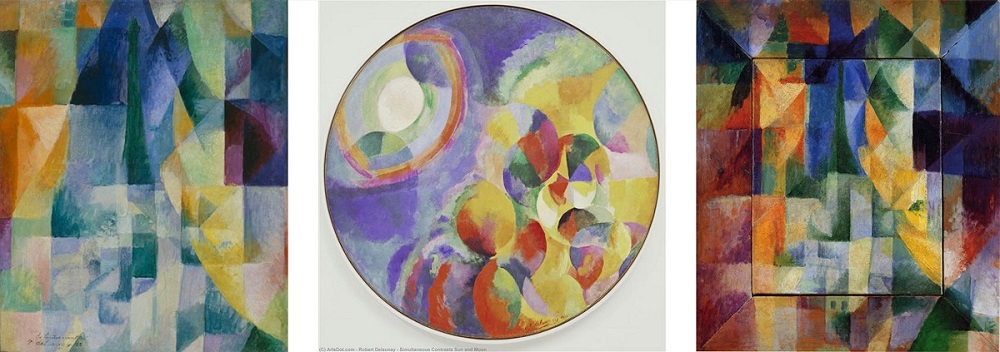
Fig. 9: Selection of works by Robert Delaunay on simultaneous constrast, from left to right: Les Fenêtres simultanées (1912), Soleil Lune Simultané 1 (1913), Les Fenêtres simultanées sur la ville (1912) ©Public domain US.
From 1912 (and in the 1930s) Delaunay devoted himself to pure colour painting and created abstract circular formations in bright colours. The artistic style created by Delaunay derived from Cubism - the Cubists themselves worked intensively with complementary contrast in their paintings - and has gone down in art history as «Orphism».
In 1913, Delaunay depicted the 12-part colour circle.
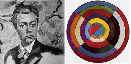
Fig. 10: Self-portrait by Robert Delaunay (1905/6), colour circle (simultaneous circle) by Delaunay (1912/3).
His abstract circular forms, which were created in his series «Rythmes», were particularly oriented towards his colour circle in terms of colour (Fig. 11).
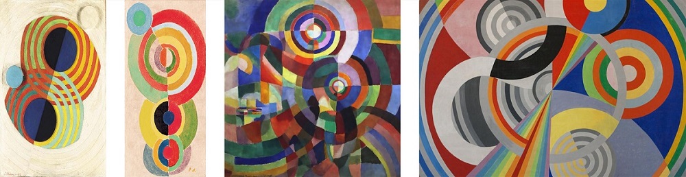
Fig. 11: Selection of works by Robert Delaunay from his «Rhytmes» series, from left to right: Rhythms (1932), Rhytme (ca. 1932), Rhytmes (1934), Rhytmes 1 (1938) ©Public domain US.
Itten's paintings were also based on his own colour studies. In his paintings he plays with contrasts and the gradations of colour, creating a harmonious interplay (Fig. 12).
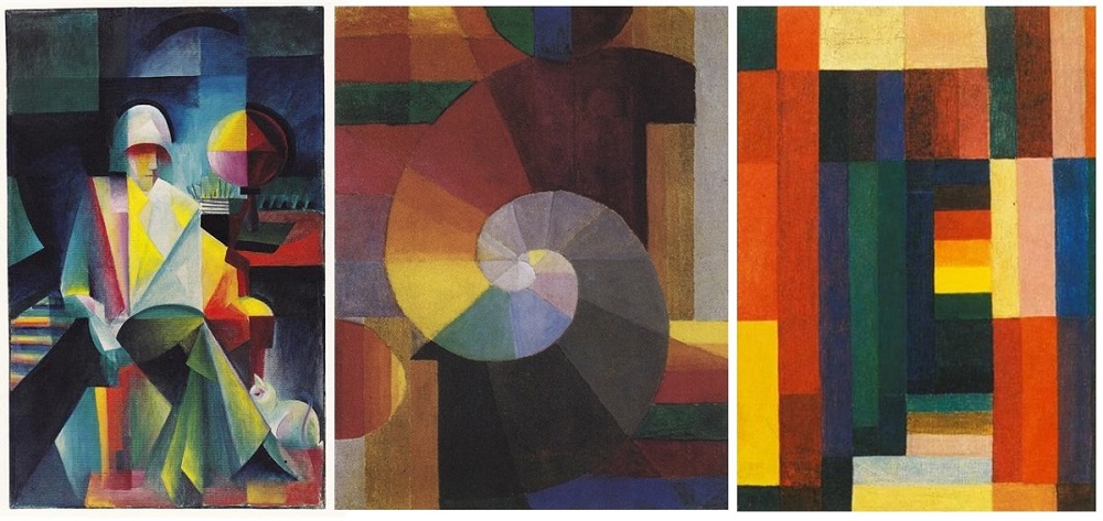
Fig. 12: Selection of works by Johannes Itten, from left to right: The River Singer (Helge Lindberg) (1916), The Encounter (1916), Horizontal Vertical (1915) ©Public domain US.
Like Itten, Wassily Kandinsky found parallels with music and divided his works into three groups based on music: Impression, Composition and Improvisation. The aim of his abstract non-objective art was fundamentally to create a harmony of colour.
The paintings titled «Impression» - were created with an orientation towards the environment and with a deliberate choice of colour that was intended to intensify what was depicted. His «composition pictures» were intended to express a certain character. Like a piece of music, he created a work of colours and forms that conveyed an expression when viewed or «played». Kandinsky is also said to have associated specific musical instruments with each colour. Among the «improvisations» he painted even more abstract pictures, which were created on impulse and unconsciously. (Fig. 13).

Fig. 13: Selection of works by W. Kandinsky, from left to right: Impression III (Concerto) (1911), Composition VIII (1923), Improvisation 27 (Garden of Love II) (1912).
With the development of TV technology in the 19th century, specifically colour TV at the beginning of the 20th century, the RGB system was created based on the three-colour theory. The three-colour theory states that all colour stimuli can be formed by mixing the three primary colours. In the RGB system, the screen colours are created by the partial mixing of red, green and blue light. In addition to the RGB system, the HLS system (H=Hue; L= Luminance, S=Saturation) was developed, which, on the other hand, is based on the colour arrangement of Albert Henry Munsell, who created a three-dimensional colour system (colour space) between 1905 and 1918, which is still widely used today. His system is based on the primary colours red, yellow, green, blue and purple as well as on the basis of «sensory equidistance». This is a construct in which the distance between the colours is perceived as equal. In 1915, he produced his Colour Atlas.
At the end of the 20th century, the proposal of a «planetary colour system» emerged. In 1983, Michel Albert-Vanel designed a multidimensional system, the planetary colour system, which takes into account the effects of colour perception. The primary colours of yellow, red, green and blue form the planets, the secondary colours their orbiting moons. In addition to the parameters of the HLS system, the parameters of contrast and material (transparency, opaque, mattness, gloss) are added.
The CMN system, which emerged three years later, showed the changes of a colour. This was created in the form of a tetrahedron, which illustrated the effect of reflection as well as transparency on the colour.
In the printing industry, the CMYK colour model is best known, which is based on the colours cyan, magenta, yellow and black («key») and examines the technical mixing ratios of their four basic colours.
In addition to the scientists and artists mentioned, there are many other faces of colour systems, including George Field with his colour circle in the shape of a flower (1846), James Clerck Maxwell with his colour triangle (1855-1860), William Benson with his colour cube (1868), Wilhelm von Bezold and Wilhelm Wundt with their colour cones (1874, 1893), Charles Blanc with his circle of six triangles (ca. 1879), Alois Höfler and his double pyramids (1883 - 1897), Wilhelm Ostwald and his double cones (1916/17), as well as many others that would go beyond the scope of this blog text in terms of content, but are nevertheless worth mentioning. At the beginning of the 20th century, mathematical «more objective» colour systems were added, including the CIE (Commission Internationale d'Eclairage) standard colour chart (1931), the DIN (Deutsche Institut für Normung) colour code (1953) or the ISCC (Inter-Society-Color-Council) colour lexicon (1955), etc., to name but a few.
Since then, the world has calmed down in its search for a new colour system and applies the aforementioned modern colour models, especially the RGB and CMYK models.
The next blog texts in the rainbow series will again focus solely on the representation of the rainbow in art, taking us back to the Baroque era.
Further literature:
Müller-Hauck, J. (1971). Was die Schönheit sei, das weiss ich nicht - Künstler, Theorie, Werk : Katalog zur zweiten Biennale Nürnberg. DuMont Schauberg: Köln.
Wagner, C (2012). Itten – Klee. Kosmos Farbe. Regensburg: Schnell & Steiner
Further links:
Pythagoras, Aristoteles, Platon, Colorsystem.com
Leonardo da Vinci Notebooks, Archive.org
https://www.gutenberg.org/cache/epub/4998/pg4998.html
Farbsysteme in Kunst und Wissenschaft « colorsystem
https://www.colorsystem.com/?page_id=771
Unterricht Wassily Kandinsky: Bauhaus Kooperation
https://mappingklee.zpk.org/narration/#
Albert Henry Munsell « colorsystem
Michel Albert-Vanel « colorsystem
From this category
Become a part of art24
Create your personal profile.
Get insights into the art market.
Buy and sell with trust.